



Two Shopify stores. Same product category. Same ad spend. Similar traffic. One does $180,000 a month and the other does $95,000. The gap is often not the product. The gap lives in the commercial architecture underneath the store: how prices are set relative to each other, how the catalog is structured, how product pages communicate value, and how the right offer appears at the right moment in the purchase flow.
Most Shopify merchants treat merchandising as a visual task. Good photos, clean layout, readable font. That's table stakes. The pricing architecture, assortment logic, collection page structure, and promotional cadence underneath those visuals are where revenue actually lives, and most merchants have never built that layer intentionally.
This playbook covers every layer of Shopify merchandising, from how to price and structure your catalog to how to run a promotional calendar that doesn't train customers to wait for sales. By the end, you'll have a framework for auditing and rebuilding every commercial layer of your store: which products deserve purchase-incentive offers, how to build collection pages that convert, and how to use your own order data to make smarter merchandising decisions.
TL;DR
- Merchandising is a commercial discipline, not a visual one. Pricing architecture, assortment strategy, and page hierarchy drive revenue more than aesthetics.
- Your pricing structure determines what AOV is possible before a single offer or discount is applied. Get the base architecture right first.
- Collection pages are where buying decisions often start. Most brands merchandise product pages obsessively and collection pages barely at all.
- The product page has two layers: presentation (photos, copy, social proof) and offer architecture. Both need deliberate design.
- Offer architecture is a strategic decision about which products get purchase-incentive treatment, and why.
- A promotional calendar prevents margin erosion. Always-on offers and time-limited promotions serve different functions and should not be confused.
- Every merchandising decision should be driven by Shopify order data and not by instinct.
What Merchandising Actually Means for a Shopify Brand
Before getting into the mechanics, the definition needs to be right. Most Shopify merchants are working from the wrong one, which is why their stores look polished and their revenue architecture is a mess.
The commercial definition
Merchandising is the practice of presenting products in a way that maximizes revenue per visitor. That means pricing, assortment, placement, sequencing, and offer architecture. Aesthetics support all of that, but they don't constitute it.
The term comes from physical retail, where shelf placement, facing counts, and planogram logic directly controlled how much product moved. A product placed at eye level on a high-traffic shelf outsold the same product on the bottom shelf by multiples, even when the price and quality were identical. That principle translates directly to ecommerce. Position on a collection page, image sequence on a product page, and where an offer widget sits in the purchase flow all have the same effect.
A merchandising strategy has to answer three questions: what to sell, how to price each product relative to everything else in the catalog, and how to present each product at every stage of the purchase path.
For the tactical execution of individual offer types like quantity breaks, BOGO, free gifts, and bundles, see the AOV optimization guide. That guide covers the mechanics. This one covers the decisions that determine when and where those mechanics get deployed.
The three revenue levers merchandising controls
Every dollar of revenue improvement from merchandising comes from moving one of three numbers: conversion rate, average order value, or return rate. The important thing to understand is that merchandising decisions affect all three simultaneously, which is why chasing a single metric in isolation leads to bad decisions.
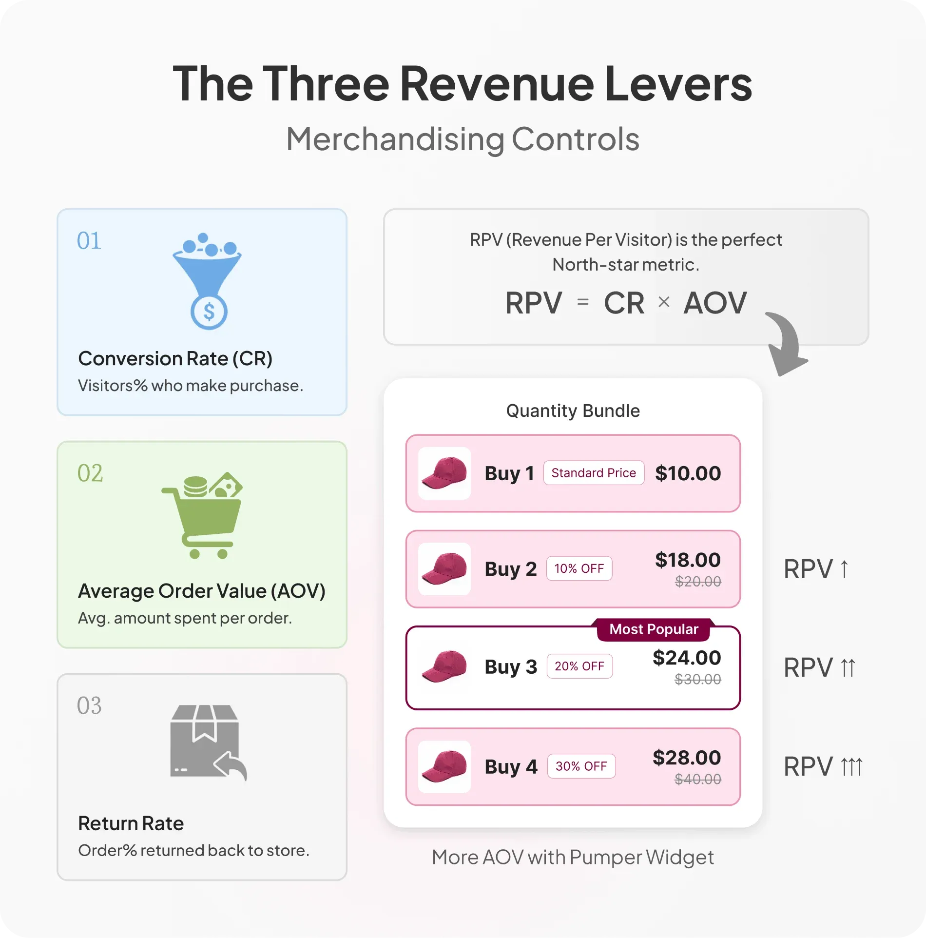
Traffic is not a merchandising lever. Traffic brings people to the store. Merchandising determines what they do once they arrive.
Revenue per visitor is the right north-star metric for merchandising quality. RPV equals conversion rate multiplied by AOV. A merchandising change that lifts AOV by 30% but drops conversion rate by 5% is still a net positive if RPV goes up. That framing prevents the common mistake of optimizing one number while inadvertently damaging the other.
Return rate is the lever most merchants ignore. Poor product page merchandising, whether that's misleading descriptions, inaccurate size guides, or bad image sequencing, inflates return rates that quietly wipe out whatever revenue gains were made. Merchandising has to be honest to be sustainable. Every section of this playbook should be evaluated against RPV, not any single isolated metric.
Pricing Architecture: The Foundation Everything Else Builds On
Pricing is where most merchants start too late. They launch products, run offers, and wonder why AOV won't budge, without realizing the problem was baked into their catalog structure months ago.
Why your pricing structure determines your AOV ceiling
A store with a $15 hero product and no logical step-up has a structural AOV ceiling.
Price laddering solves this. The practice involves structuring your catalog so there are natural spending steps from entry-level to premium.
A skincare brand with a $14 cleanser, a $38 serum, and a $72 moisturizer has a natural ladder. Shoppers at different spending levels can always find a reason to spend a little more, and each step up feels like a logical progression rather than a leap.
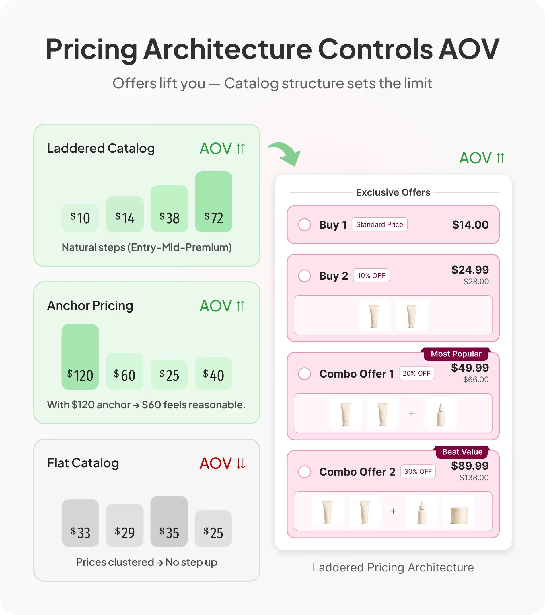
The gap problem is what happens without a ladder. A catalog where products are clustered at one price point, say $25 to $35 across the board, gives shoppers no mechanical reason to spend more. Offers and bundles can bridge the gap partially, but a better starting point is a catalog that already has meaningful price variation built in.
Anchor pricing adds another layer. The highest-priced item on a collection page sets the psychological reference point for everything else. A $120 item on a collection page makes everything priced at $60 feel reasonable, even if $60 was above the shopper's initial intention.
Dan Ariely's research on price anchoring showed this effect across multiple categories: the presence of a high-priced option systematically shifts willingness to pay for mid-range alternatives. On Shopify, that anchor lives at the top of your collection grid.
Pricing products based purely on cost-plus margin without considering how prices relate to each other is where most merchants start. The stronger approach is designing a price architecture where entry, mid, and premium tiers exist, each serving a different shopper psychology and giving every visitor a direction to move.
Psychological pricing: what actually works on Shopify
The tactics that genuinely move Shopify conversion are a short list. Most of them cost nothing to implement.
Charm pricing, setting prices at $19.99 rather than $20, works for products under $50, where the left-digit change is meaningful. Above $100, it reads as cheap rather than economical, and it can work against a brand with premium positioning.
Round pricing signals confidence. Luxury and premium DTC brands consistently use round numbers because a price like $120 or $85 implies the brand didn't need to trim a penny to make the product feel affordable. If margin ambition is part of the brand strategy, charm pricing on premium lines can quietly undermine it.
Comparative pricing anchors the shopper to a higher number: "Regular: $45 / Now: $32." The critical rule is that the higher number has to be real and defensible. Shoppers who discover a fabricated "was" price don't come back, and in several markets fake reference pricing is a legal liability.
Bundle pricing math should make the value obvious. "3 for $42 (save $18)" consistently outperforms "3 for $42 (20% off)" because dollar savings are more concrete than percentages for most shoppers. The mental math is done for them.
A deliberate pricing style guide, round numbers for premium lines and charm pricing for entry-level or promotional items, applied consistently across the catalog, is what separates stores that feel coherent from stores that feel like a price mismatch waiting to confuse someone.
Margin architecture and its impact on offer strategy
Not every product should get the same offer treatment. This is a structural decision that needs to be made before any specific promotion is planned.
A margin map is the starting point: a simple product-level view of gross margin percentages. Before deploying any offer, you need to know which products can absorb a 15% discount without destroying profitability and which cannot. High-margin SKUs are ideal candidates for discounts and free gift mechanics. Low-margin products need different incentive structures.
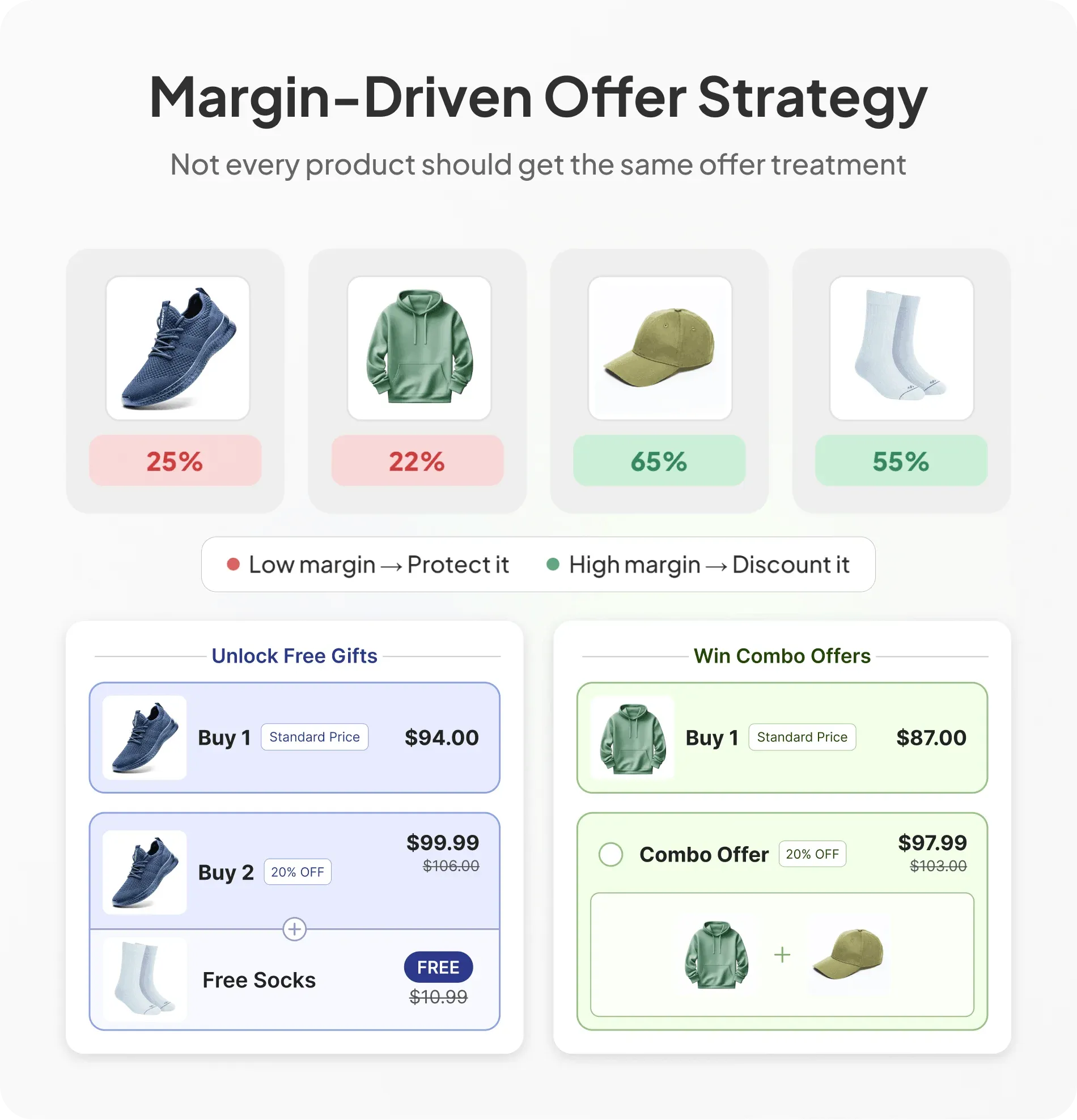
Bundle mechanics are one way to protect margin on low-margin heroes. Pairing a low-margin hero product with a high-margin accessory in a bundle can lift the blended margin on the transaction while also increasing AOV. The decision to do that is a merchandising decision before it's a technical one. The Pumper pricing model, where merchants pay more only as the app generates incremental revenue, is built on this logic: offer mechanics should be margin-positive or they shouldn't run. The $0 free plan lets merchants validate that before any cost is incurred.
The point here is not accounting. The point is that every offer decision needs a clear answer to the question: does this product have the margin to support what I'm about to do to it?
Shopify Assortment Strategy: Building a Catalog That Sells Itself
Catalog size is not catalog strength. Most Shopify stores have more products than they can effectively merchandise, which means a large portion of their SKUs are quietly consuming inventory, operations attention, and page real estate without contributing proportionally to revenue.
1. Hero products, supporting SKUs, and dead weight
Every product in a Shopify catalog plays one of three roles.
- Heroes drive traffic and first purchases.
- Supporting SKUs increase AOV and repeat purchases.
- Dead weight consumes resources without contributing proportionally to revenue.
Most brands carry too much dead weight and under-invest in their heroes.
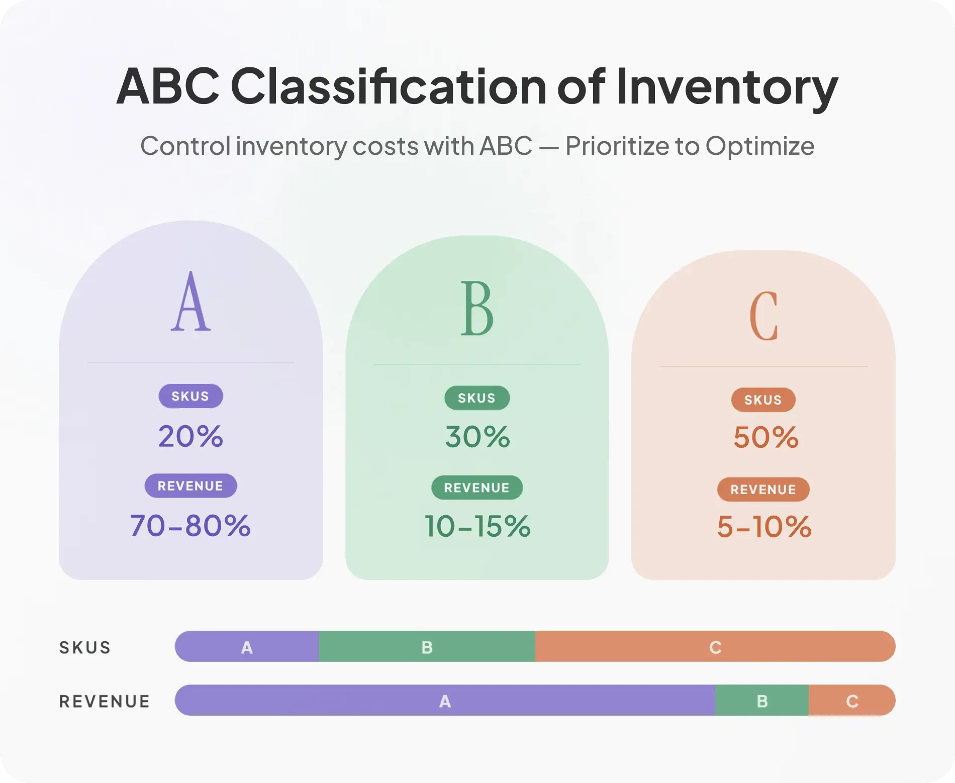
ABC analysis gives you the map. By ranking products by their financial impact, you will typically find Class A items (just 15 to 20% of your SKUs drive 70 to 80% of your revenue). Classes B and C make up the rest of your catalog but yield much smaller returns.
2. Identifying bundle candidates from assortment data
Products that are frequently bought together in the same transaction are natural bundle candidates. And a formal bundle simply makes that behavior easier to do and more rewarding when the customer does it.
Shopify's Analytics section includes reports on product sell-through rate and order composition. The threshold worth acting on: products that appear together in more than 10 to 15% of orders containing either item are candidates for a formalized bundle.
The bundle candidate criteria go beyond frequency. The products need a complementary use case (they solve adjacent problems), compatible price points (a $90 product bundled with a $4 item `feels like a freebie, not a bundle), and positive blended margin.
3. Catalog depth vs. breadth: what most Shopify brands get wrong
Depth (more variants, sizes, or formulations of proven winners) almost always outperforms breadth (more distinct product lines) for both Shopify revenue and operational efficiency.
The reason breadth creates complexity without proportional revenue is that each new product line requires photography, copy, inventory management, and catalog placement decisions. Most new lines fail to earn back that investment in their first year, and in the meantime they're diluting the attention and budget that could have gone to a proven hero.
Breadth makes sense in one specific scenario: category extension into a logically adjacent need the existing customer base already has. A haircare brand adding scalp treatments is depth in a new form. The same brand launching a skincare line is breadth into an unrelated category.
Collection Page Merchandising: Where Buying Decisions Begin
The collection page is doing more commercial work than most Shopify brands realize. For first-time visitors arriving from category-level ads or organic search, it's often where buying intent forms for the first time.
Why the collection page is the most under-optimized page on most Shopify stores
Between 40 and 60% of Shopify sessions include a collection page view. At that volume, a 5% conversion rate improvement on collection pages moves more revenue than a 10% improvement on the product page. Most merchants have this backwards, spending months on product page tests while leaving collection pages completely untouched.
A collection page has three jobs: filter the catalog to relevant products, create confidence that the brand has what the shopper is looking for, and drive a click-through to a product page. Most collection pages only do the first one. A product grid sorted by "Best Selling" with nothing else on the page is a directory. A brief introductory line, a hero product featured above the grid with "Our #1 Bestseller" badge, and some orientation for first-time visitors turns that same page into one that actively sells.
Sort logic and featured product strategy
Where a product appears in a collection grid directly determines how many shoppers see it. "Best Selling" is defensible as a default because it surfaces products with the strongest conversion history, but it should not be left unmanaged. New launches, high-margin items that need visibility, and seasonally relevant products all warrant a manual override.
The pinned product strategy handles this without requiring the merchant to sort the entire catalog manually: pin one or two products to positions one and two, let everything else sort by "Best Selling" behind them. Product badges ("Bestseller," "New," "Low Stock") increase click-through rate by answering the question every shopper has when scanning a grid: which one deserves my attention first.
Filtering, navigation, and reducing catalog friction
Filters should reflect how shoppers think about products, not how the merchant organizes inventory internally. The most underused and highest-converting filter dimension is concern or use case. "Shop by Goal" or "Shop by Concern" navigation lets shoppers self-segment and arrive at a tighter, more relevant product set. When a specific segment accounts for more than 15% of search queries within a category, it deserves its own collection page, which also becomes an SEO landing page and compounds in value over time.
Product Page Merchandising: The Commercial Layer
The product page is where most Shopify brands concentrate their optimization energy, and for good reason: it's where the add-to-cart decision gets made. The problem is that most product pages are only half-built. The presentation layer gets attention. The commercial layer underneath it rarely does.
Visual hierarchy: sequencing images to close the sale
The order of product images is a selling sequence, not a gallery. Most brands upload images in whatever order the photographer delivered them, which is usually not the order that moves shoppers to purchase.
A sequence that works for physical products addresses different shopper questions in order of likelihood: hero shot on a clean background first, lifestyle shot showing the product in use second, detail or texture shot third, scale shot fourth (the product next to a hand, a person, or a familiar object), a UGC or before-and-after fifth, and a "reasons to buy" infographic to close. Each image answers a question the previous one left open.
The scale shot is the most underused and most predictably high-converting image in that sequence. Shoppers buying furniture, accessories, and home goods consistently cite size mismatch as a return reason. A scale shot removes that friction before purchase. Video placed second or third in the carousel outperforms static images for any product with a functional demonstration. A 15 to 30 second clip showing how something opens, applies, or assembles beats six static images of the same thing.
Product copy that sells: the commercial writing structure
Most Shopify product descriptions are written from the inside out: what the product is, what it contains, what it does. High-converting copy starts from the outside: what the shopper is trying to achieve and how this product gets them there.
A four-part structure works across categories. An outcome-led headline (not the product name, but what the product does). A short empathy line that names the problem or desire. Feature-benefit pairs in the body. A proof line to close, whether that's a stat, a customer quote, or a certification.
The bullet points in a product description are often the only copy a first-time visitor actually reads. Each bullet needs to carry one complete benefit. "Premium materials" tells a shopper nothing. "Made with 316L surgical steel, the same grade used in medical implants" gives them something to hold onto.
Social proof placement and what actually converts
Placement matters as much as presence. Reviews buried below the fold do not meaningfully lift conversion. Reviews near the product title do.
Curate which reviews are featured rather than defaulting to the most recent. A specific review that addresses a real objection ("the only collagen supplement I've tried that doesn't taste chalky") does more commercial work than ten generic five-star ratings. Twelve reviews averaging 4.9 stars routinely outconverts 200 reviews at 4.2. Trust badges and certifications belong in the purchase zone near the add-to-cart button, not in the footer.
Offer architecture on the product page: the strategic layer
Whether a product gets an offer, which offer type, and where it sits on the page are merchandising decisions, not afterthoughts. Offers on low-margin SKUs can quietly destroy profitability at scale. The right candidates are high-margin products, natural multi-unit products, and products where an offer reinforces the brand's positioning rather than cheapening it.
The offer widget belongs between the product description and the add-to-cart button, where purchase intent is highest. Social proof should come before the offer in the page hierarchy: establish that the product is worth buying, then give the shopper a reason to buy more of it. Reversing that sequence reduces both trust and offer uptake.
Promotional and Seasonal Merchandising Cadence
Most Shopify merchants run promotions reactively, which means their promotional calendar is really just a discount calendar, and discount calendars train customers to wait.
Always-on offers vs. time-limited promotions: a critical distinction
These are two different commercial tools that serve entirely different functions.
Always-on offers build purchasing habits and baseline AOV. A quantity break on a hero consumable, a standing bundle on a starter kit, a subscribe-and-save option on a replenishment product: these live on the product page every day, for every visitor. Structural, not promotional.
Time-limited promotions create urgency and reactivate lapsed buyers. A Black Friday BOGO, a Valentine's Day gift bundle, a clearance sale. These have start and end dates, communicate urgency explicitly, and get merchandised sitewide.
The discount conditioning trap is what happens when merchants blur the two. Running a 20% off sitewide sale every month teaches existing customers to wait. Structural offers avoid this because they require the customer to act differently (buy more) rather than simply delay purchase until the price drops.
Building a 12-month merchandising calendar
A merchandising calendar tracks offer rotation, collection page updates, homepage refreshes, photography timing, and product launches, not just when discounts run.
The skeleton that works across most Shopify brands: four major promotional moments (Q4, one spring event, one summer clearance, one brand-specific event), with the rest of the year running on always-on structural offers. Collection sort order and hero product placement should also update seasonally rather than staying frozen at whatever the January configuration was.
How to run a promotional event without training customers to wait
The pre-sale dip is evidence that discount conditioning is already happening. Organic orders drop the week before a known promotional event as engaged customers delay purchase. Brands that minimize this dip have strong always-on mechanics that make the promotional event incremental rather than the primary buying window. Exclusivity framing ("our once-a-year bundle," "limited to 200 units") signals scarcity without implying the product is perpetually discounted.
Data-Driven Merchandising: Reading Shopify Analytics to Make Better Decisions
Shopify's native analytics contain most of the merchandising intelligence a brand needs to make good decisions. Most merchants check total revenue and top-selling SKUs. Almost no one builds a regular merchandising review routine from the rest of the data that's already available.
The 5 reports every Shopify merchandiser should run monthly
Sales by Product (Analytics > Reports) identifies A, B, and C tier products. Running this monthly and flagging any C product that has sat in the bottom tier for three consecutive months turns the report into an action list. That product is either a cut candidate or a bundle filler candidate.
Conversion Rate by Product (available via Shopify Analytics or third-party tools like Littledata) reveals product pages that receive meaningful traffic but don't convert. Those are merchandising problems: copy, imagery, pricing, or absence of social proof. A product that ranks on Google and drives traffic but converts at 0.4% has a page problem, not a traffic problem.
Average Order Value Over Time (Analytics > Overview) should be tracked weekly. An AOV dip in a specific week often corresponds to a product page change, an offer going inactive, or a traffic source shift. Catching it weekly means a 10-day-old problem, not a 45-day-old one.
Top Landing Pages (available in Google Analytics or Shopify's built-in Sessions by Landing Page report) tells you which pages shoppers arrive on first. If a collection page is a top landing page, it needs to work as hard commercially as any product page.
Product Performance by Traffic Source (requires Google Analytics or a tool like Triple Whale) reveals which products convert well from paid traffic versus organic versus email. A product that converts at 4.2% from email and 0.8% from paid search isn't the same commercial problem from both channels. Email visitors already know the brand. Paid visitors are arriving cold. Different page treatment, different offer architecture, and different creative are warranted for each.
Using order data to drive assortment and offer decisions
The two highest-value merchandising insights buried in Shopify order data are co-purchase frequency and repurchase interval. Both are available in the order export and rarely analyzed.
Co-purchase analysis starts with exporting the last 90 days of orders. In each order with more than one product, note what appeared together. Products that co-appear in more than 10% of multi-item orders are bundle candidates. This is data-validated bundling rather than guesswork about what shoppers might want to buy together.
Repurchase interval analysis is specifically useful for consumable products. What is the average time between a customer's first and second purchase of the same product? That interval is the natural subscribe-and-save period.
A customer repurchasing a protein supplement every 27 days should be offered a 28-day subscription, not a monthly one. The product is running out slightly before the month is up, which means a monthly subscription creates a gap in their supply and a reason to cancel.
Return rate by product is the third data point worth pulling regularly. Products with return rates above 15% often have a merchandising problem rather than a quality problem. A product that customers consistently return is often a product whose page overpromised: unrealistic lifestyle imagery, ambiguous sizing information, or copy that described an outcome the product can't reliably deliver.
The Merchandising Audit: Six Questions to Run on Your Store This Week
Spend 20 to 30 minutes in your Shopify admin and analytics to answer each of the following. A "no" answer to any of them is a specific, actionable gap with a clear fix.
1. Do your product prices form a logical ladder with meaningful steps between entry, mid, and premium?
If not: identify the gap in your catalog and either add a mid-tier product or restructure your bundle pricing to create a spending step that doesn't currently exist.
2. Are your top three revenue-generating products pinned to positions one through three on their collection pages with a visible "Bestseller" badge?
If not: update your collection sort order today. This takes approximately 10 minutes and has direct revenue impact with no additional cost.
3. Does your product page image sequence include a scale shot and at least one lifestyle image showing the product in use?
If not: prioritize a photography session for your top three A-tier products. These are the pages driving the most revenue, and they're the ones where better imagery moves the most aggregate revenue.
4. Are any products that are frequently bought together (more than 10% co-occurrence in orders) formalized into a bundle with a combined discount?
If not: pull your order export and run a co-purchase analysis. Create a bundle for your top co-purchase pair within 48 hours.
5. Do you have at least one always-on structural offer (quantity break, bundle, or free gift with purchase) active on your top-selling product page right now?
If not: install Pumper Bundles, set up a quantity break on your hero product, and let it run for 14 days before evaluating performance. The free plan covers this.
6. When did you last update your collection page sort order or pin rotation?
If the answer is "never" or "over three months ago": schedule a monthly 30-minute merchandising review to refresh sort logic, update pinned products, and review badge assignments. Put it in the calendar before closing this tab.
Conclusion
The brands generating the most revenue per visitor on Shopify are rarely the ones with the best products or the highest ad spend. They're the ones who treat their store as a commercial system, every price point set relative to another, every collection page sort logic reviewed monthly, every product page built to answer a specific shopper objection, every offer deployed on the right product at the right margin.
Run the six-question merchandising audit on your store today.
If there are any gaps, install Pumper Bundles free and have your first structural offer live before the end of day.
FAQs
1. What is Shopify merchandising?
Shopify merchandising is the practice of structuring your catalog, pricing, collection pages, and product pages to maximize revenue per visitor. It covers assortment decisions, pricing architecture, page hierarchy, and promotional strategy rather than visual design.
2. How is merchandising different from conversion rate optimization (CRO)?
CRO focuses on removing friction from the existing purchase path. Merchandising shapes the commercial architecture the shopper moves through: what products appear, in what order, at what price, with what offer. Merchandising decisions often move more revenue than CRO because they change what shoppers buy, not just whether they buy.
3. What's the most impactful single merchandising change a Shopify store can make?
For most stores, updating collection page sort logic to pin the top three revenue-generating products to the first positions, combined with applying a "Bestseller" badge, delivers an immediate revenue lift with no cost and under 15 minutes of work.
4. How often should Shopify merchandising decisions be reviewed?
Collection page sort order and pinned products should be reviewed monthly. Pricing architecture should be reviewed quarterly. Offer performance should be reviewed every two weeks using per-offer analytics.
5. Does merchandising strategy change for large vs. small Shopify catalogs?
The principles are the same; the execution tools differ. A 15-SKU store can manually merchandise everything. A 500-SKU store needs automated sort rules, metafield-based filtering, and a more disciplined ABC analysis to make the same decisions at scale. Offer deployment also needs to be more selective as catalog size grows.